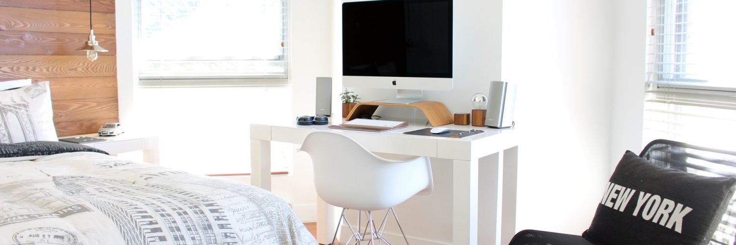
Having your own space is surely exciting. You can sleep in on weekends. You can invite your pals every Friday night. You basically have your own permission to be sloppy. But should you be?
Bachelor pads have this reputation of not being a pretty sight. Upon hearing the word, some may conjure images of dirty sinks, ceilings filled with cobwebs, and grimy linens. On top of that, some bachelor pads are often thought of as bland and even tasteless. However, some men actually try their best to make their spaces look stylish and effortlessly cool, but often, they end up having a poorly designed quarter.
If you don’t want to be embarrassed by your space if your parents, friends, or girlfriend come over, you need to properly design your apartment. Plan properly and avoid some blunders committed by other men.
Here’s a list of mistakes that you need to do away with:
Mistake #1: Not Creating Zones
If there’s one thing that many bachelors often overlook when it comes to their spaces, it’s the lack of boundaries between zones and “rooms.” Sometimes, the bedroom doubles as the living room, or the living room doubles as the dining area. With that, you may want to install dividers or walls to separate your rooms. This will also provide you with a lot of privacy in case your family or friends come over. Now, if you have minimal space, you don’t have to build walls. Your bookshelves, office tables, TV table, and even clothes rack may double as dividers.
Mistake #2: Not Picking a Color Palette That Works
Colors are a tricky thing to deal with. You can be adventurous, but you also run the risk of having a palette that looks awkward. Chocolate-brown hardwood floorboards from a flooring company paired with neon yellow walls and ceilings may not be as creative and stunning as you imagine. If you want to stay on the safe side, stick to classic tones, usually neutrals. These include white, cream, beige, grey, and even black. In case you want to go beyond these choices, seek the advice of someone who has a good color sense.
Mistake #3: Not Installing More Storage
You may be implementing a Scandinavian-Japanese design, which is all about minimalism. And to achieve that, you reduce the number of furnishings in your home. However, it does not work that way. Clean designs, such as Swedish and Japanese aesthetics, are not centered on the lack or absence of objects. They are all about organization and keeping things in place. With that in mind, you need to install smart shelves and storage areas to organize your items easily.
Mistake #4: Using Tacky Furniture Pieces

Your furniture pieces should match the overall aesthetic theme of your pad. This means that you will need to buy sofas with less ornate designs if you want to achieve that neat Scandinavian look – think of the items you see on IKEA. Do away with furniture pieces that look out of place – these include lawn chairs (if you have put it inside to achieve that beach-feel look).
Mistake #5: Forgetting the Lighting
You may be too focusing on the colors of the walls and the types of furniture you put in that you forget the lighting. The beauty of your space can be easily highlighted when using the right lights. In this case, avoid fluorescent lights; instead, go for warm lights. Better yet, install a lighting system that has a task and ambient setting. When it comes to designs, go for something hip and cool, such as track lighting or a repurposed chandelier.
Keep your home simply stylish
Keeping your home stylish may be the least of your concerns. But remember that your space is an extension of your personality. Create a good impression by making your home comfortable and great-looking!

